Washtenaw County Office of the Prosecuting Attorney
Ann Arbor, MI (Remote)
Role: Contract Graphic Designer
Experience: Blending my background in design and education, I’ve had the opportunity to create content that helps community members better understand how their local government works for them. In this role, storytelling through design has been one of the most powerful tools for communicating human experiences and everyday interactions with the justice system. I see graphic design here as more than making things visually appealing—it’s a direct line of communication that builds trust, promotes safety, and empowers residents with information. Through collaboration and feedback with the policy team, I’ve helped produce materials that not only inform but also inspire positive community engagement and change.
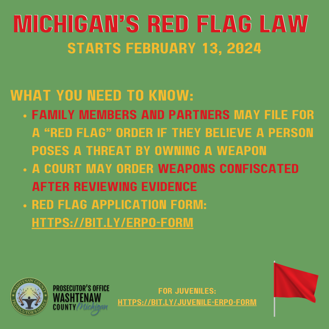
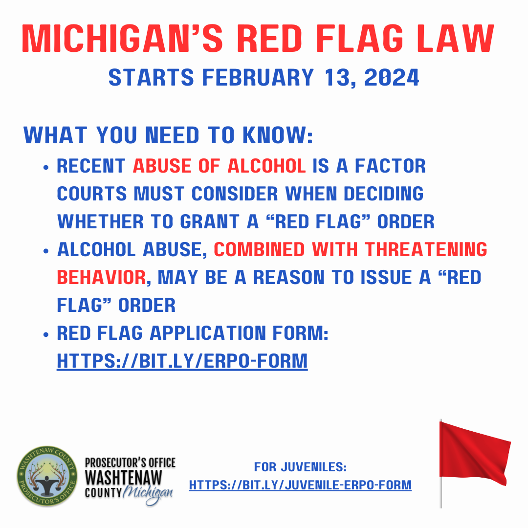
Red Flag Law Campaign
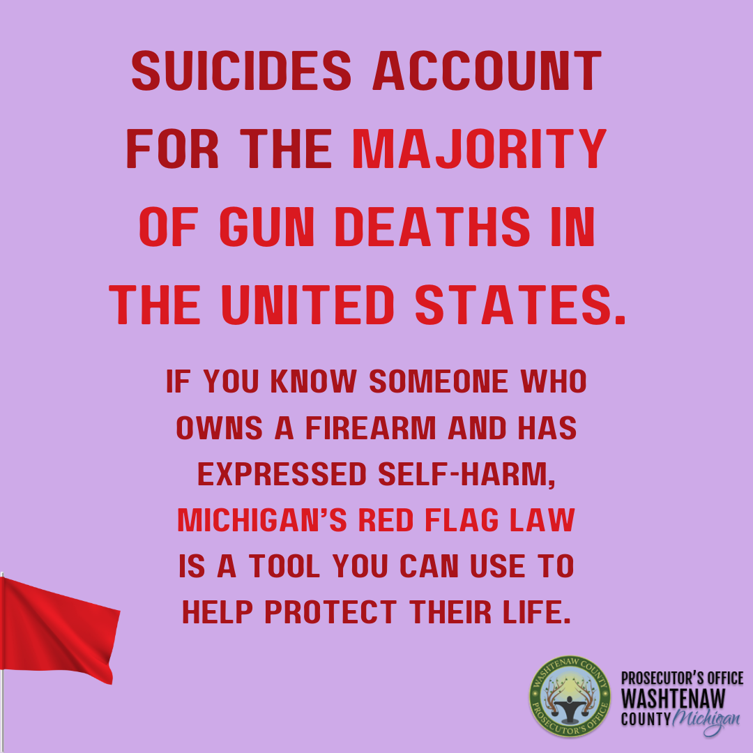
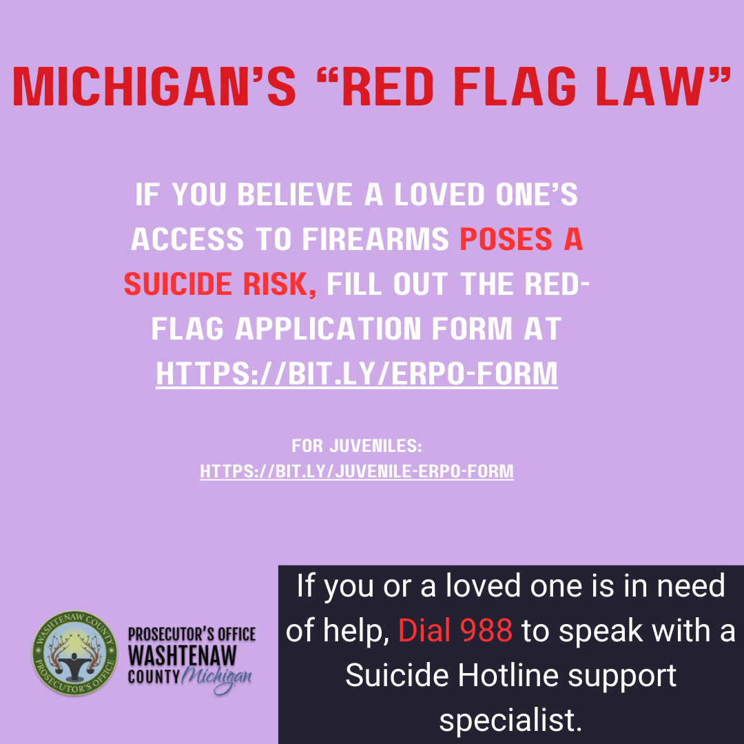
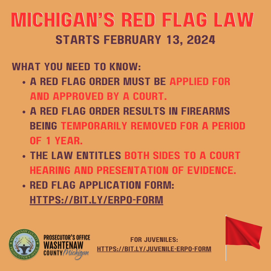
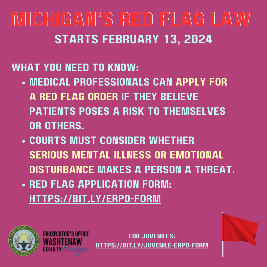
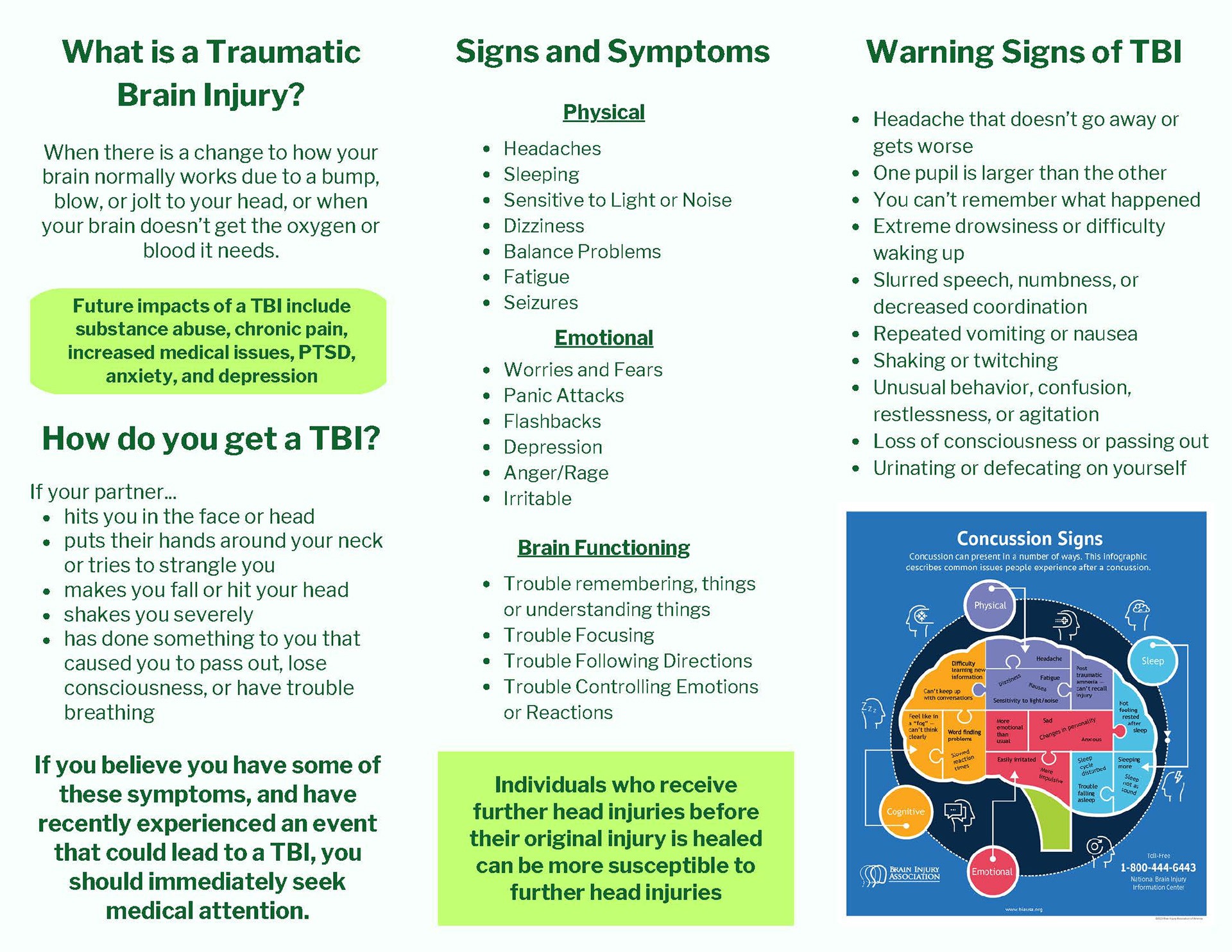
Task: In Spring 2023, Michigan passed the Extreme Risk Protection Order (ERPO) law, allowing certain individuals to petition the court to temporarily restrict firearm access for people at risk of harming themselves or others. With the law going into effect on February 13, 2024, our team was charged with creating a series of public service announcements (PSAs) to educate both potential petitioners and gun owners about the law’s scope, protections, and procedures.
Given the high-profile and often polarized nature of the topic, the goal was to deliver clear, balanced messaging that promoted public safety while respecting Second Amendment rights. My specific responsibility was to design and lay out each graphic, ensuring visual clarity, accessibility, and alignment with the campaign’s tone. The written language and messaging were developed in collaboration with policy experts and communications staff. All graphics were formatted in square ratios optimized for social media and distributed through partner channels like the ACLU of Michigan and various county agencies across the state.
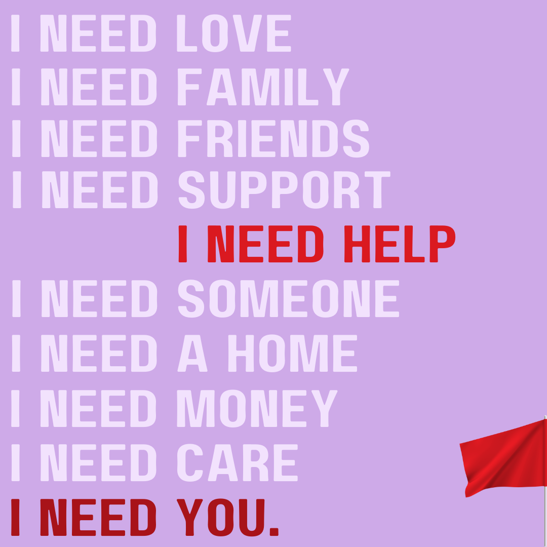
I Need You
Description: When I first learned about this project, my immediate concept was to focus on the emotional urgency behind the law, highlighting that it offers a critical tool for someone who recognizes the warning signs in a loved one. I designed the graphic to visually build toward the ultimate, often unspoken plea: “I need help.”
The goal was to help viewers realize that the person they’re concerned about may not be able to ask for help directly, but this law empowers them to step in before it’s too late. The design speaks to both the emotional weight and the preventative power behind the law.
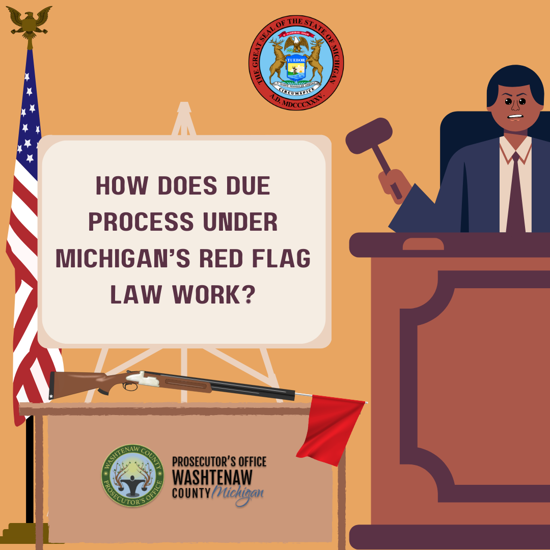
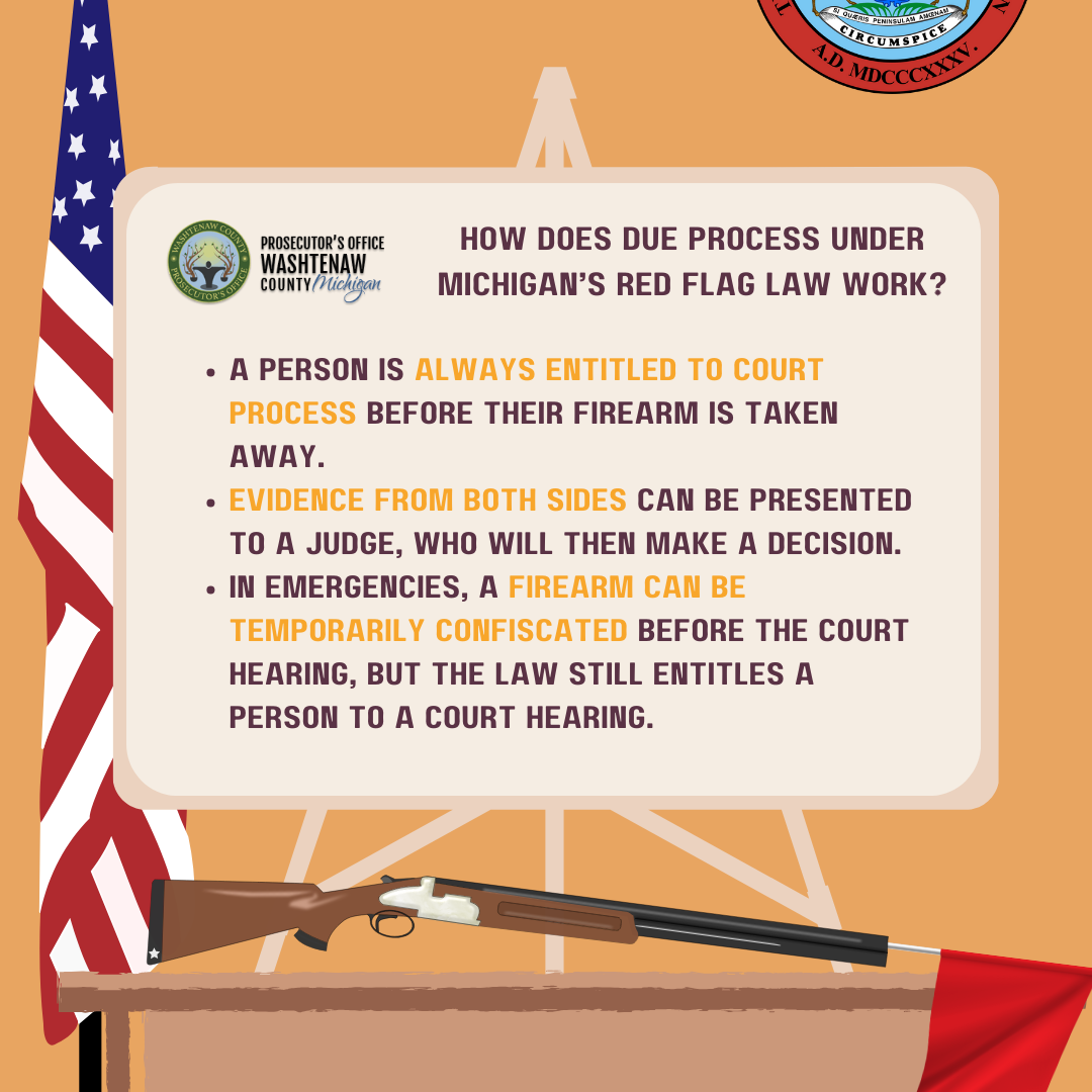
Red Flag Due Process
Description: Given the sensitivity of the topic, it was important to create a graphic that directly addressed how the ERPO (Extreme Risk Protection Order) process still protects an individual’s Second Amendment rights through the court system. To convey this, I designed the graphic with a courtroom setting and a judge as the focal point, reinforcing that while the law was established by legislators, it’s ultimately the courts that review the evidence and make the final decision. The goal was to visually emphasize fairness, due process, and judicial oversight.
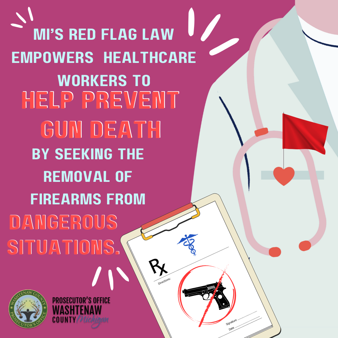
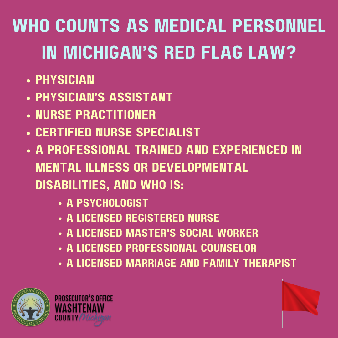
Medical Personnel
Description: The ERPO law specifically empowers medical personnel to advocate for their patients if they recognize warning signs that someone may be at risk of harming themselves or others. To visually communicate this message, I designed a graphic featuring a prescription pad with a written order for firearm removal—a striking and relatable image for those in the healthcare field. The goal was to create a strong visual metaphor that speaks directly to medical professionals about their unique role in preventing crisis situations.
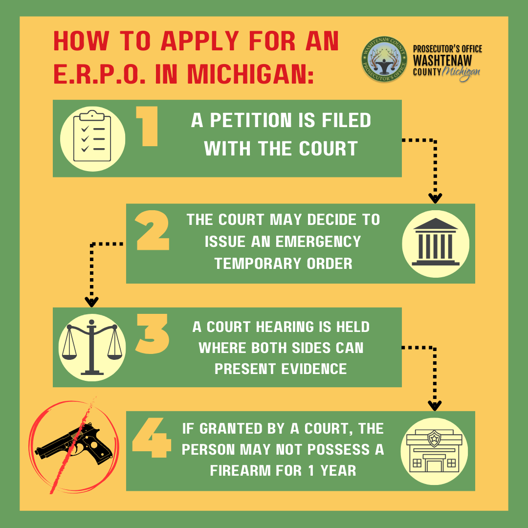
Applying for an ERPO
Description: For this graphic, the primary goal was to clearly communicate the step-by-step process of applying for and receiving an Extreme Risk Protection Order (ERPO). Working closely with policy experts, we broke the procedure into four simple steps: filing the petition, waiting for the court to schedule the case, the judge hearing both sides, and the final decision on whether the ERPO is issued. To make the process more approachable and easy to follow, I included icons representing each stage, ensuring the information felt both accessible and action-oriented for all audiences.
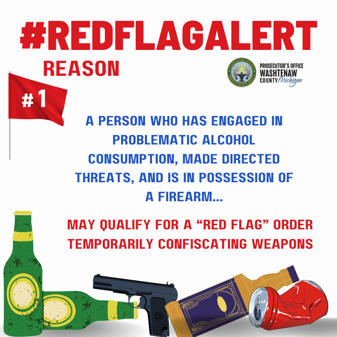
#REDFLAGALERT
Description: To help viewers recognize situations where an Extreme Risk Protection Order (ERPO) may be appropriate, I developed a #REDFLAGALERT graphic series highlighting common warning signs. This example focuses on problematic alcohol use—a behavior that can raise serious safety concerns and may warrant action under the ERPO law. The goal was to create visually bold, attention-grabbing graphics that encourage viewers to pause, reflect, and take steps to protect loved ones when concerning patterns emerge.
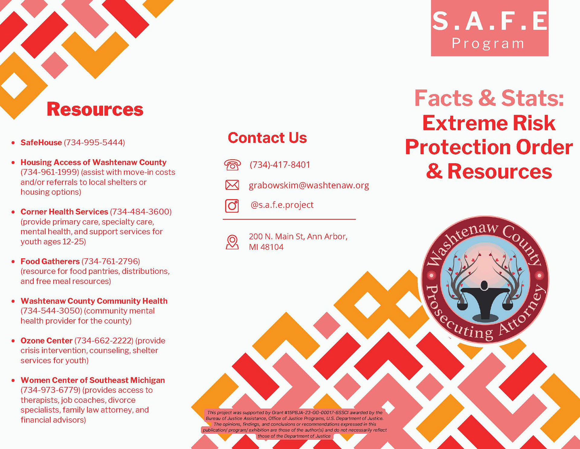
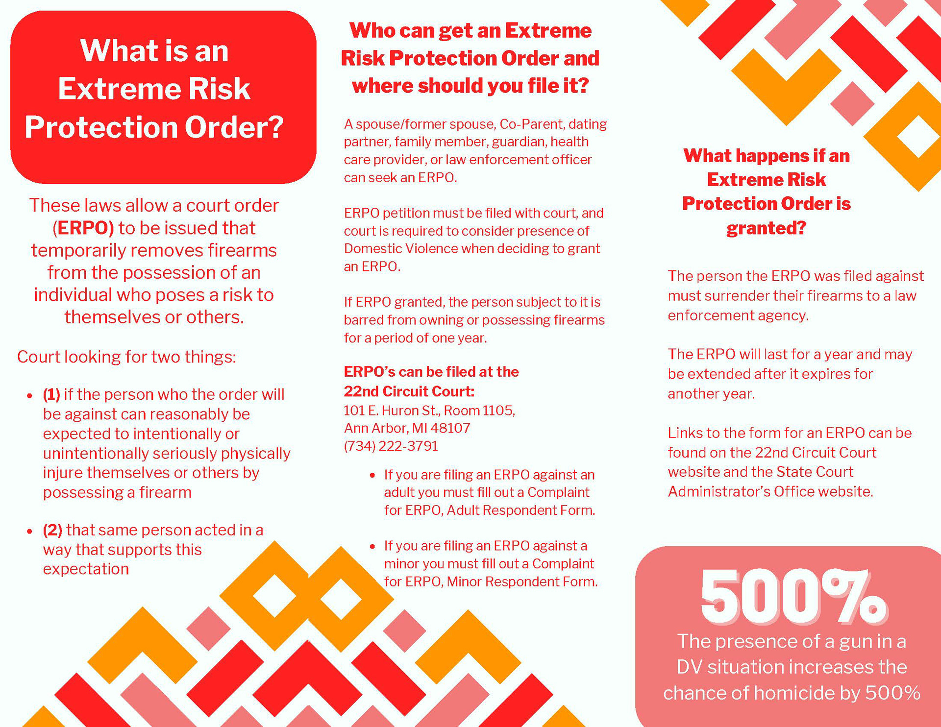
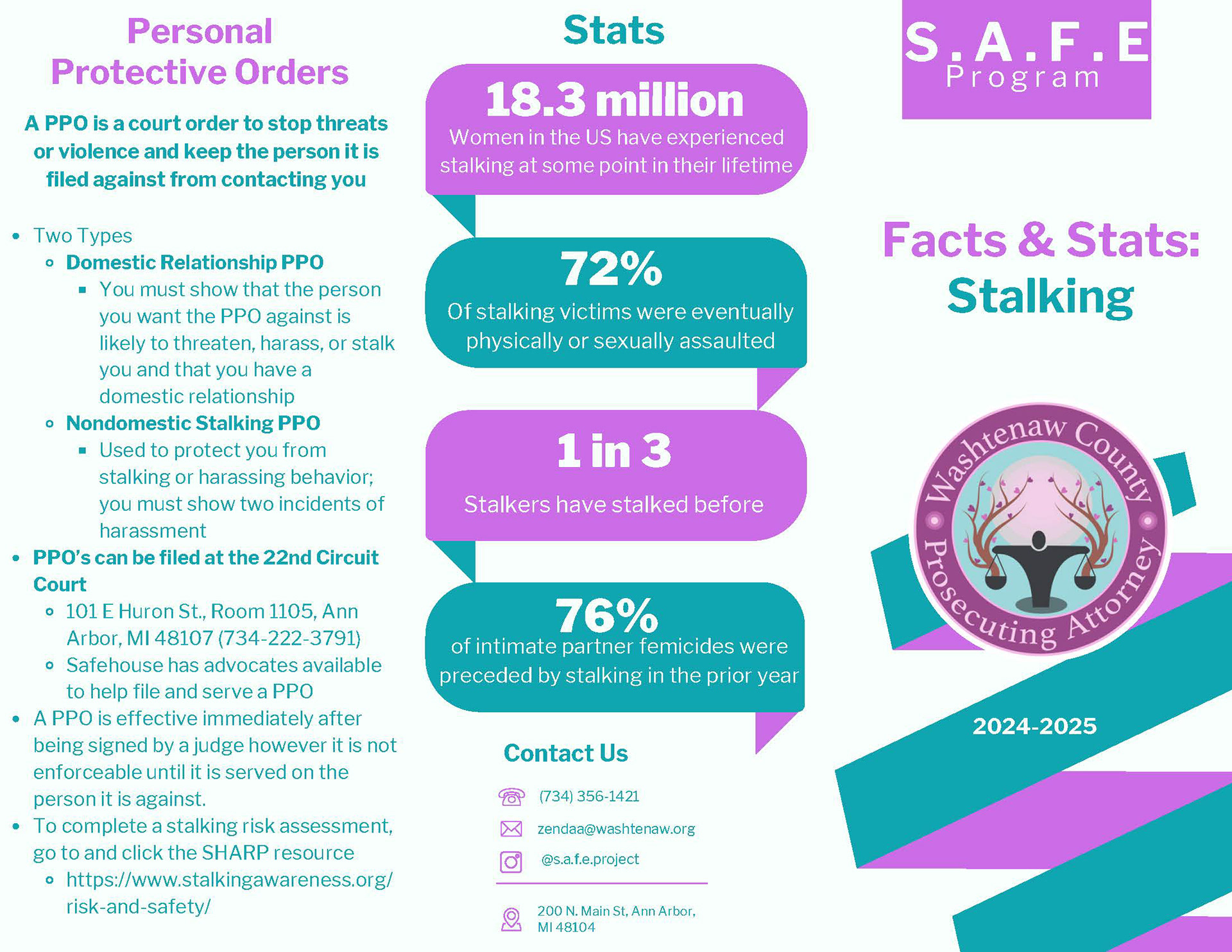
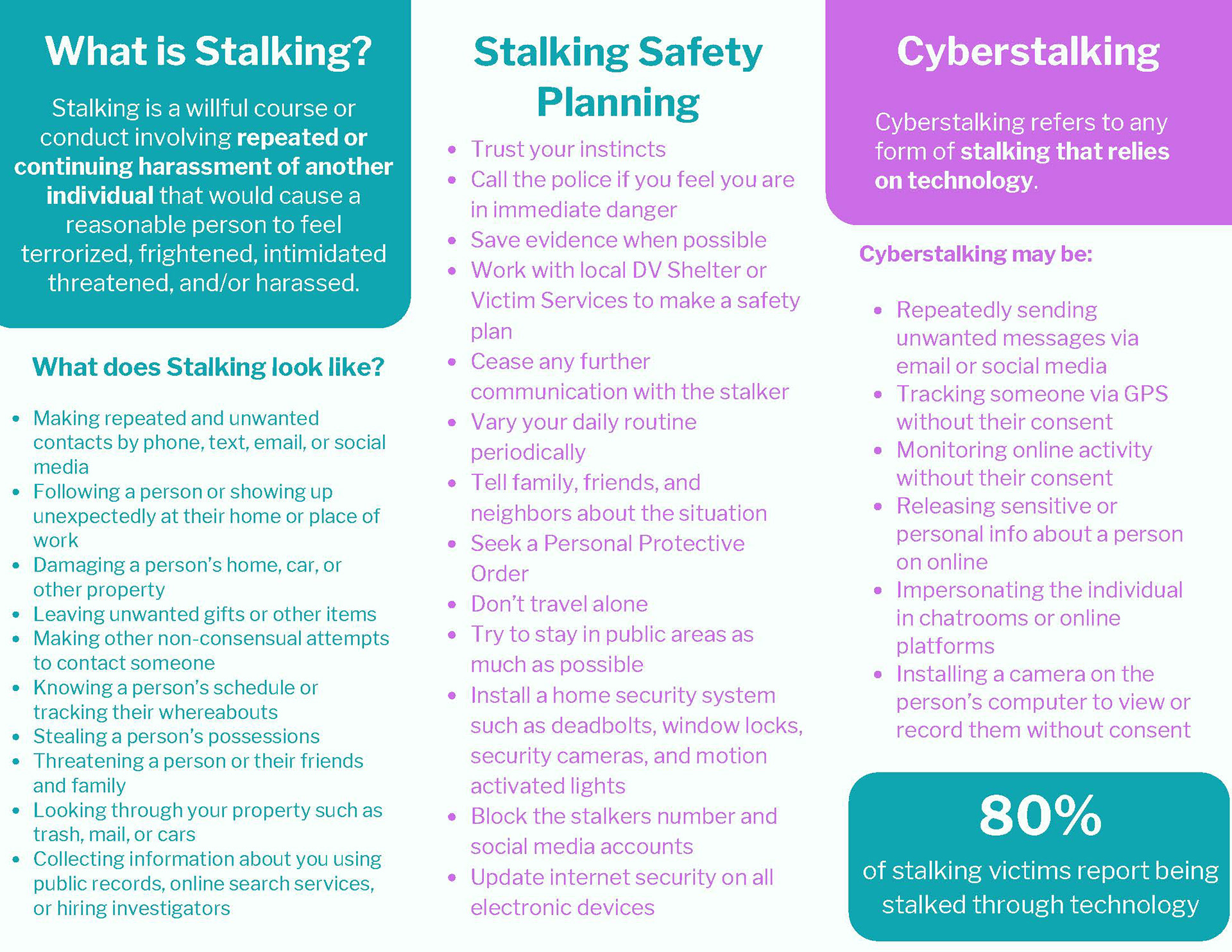
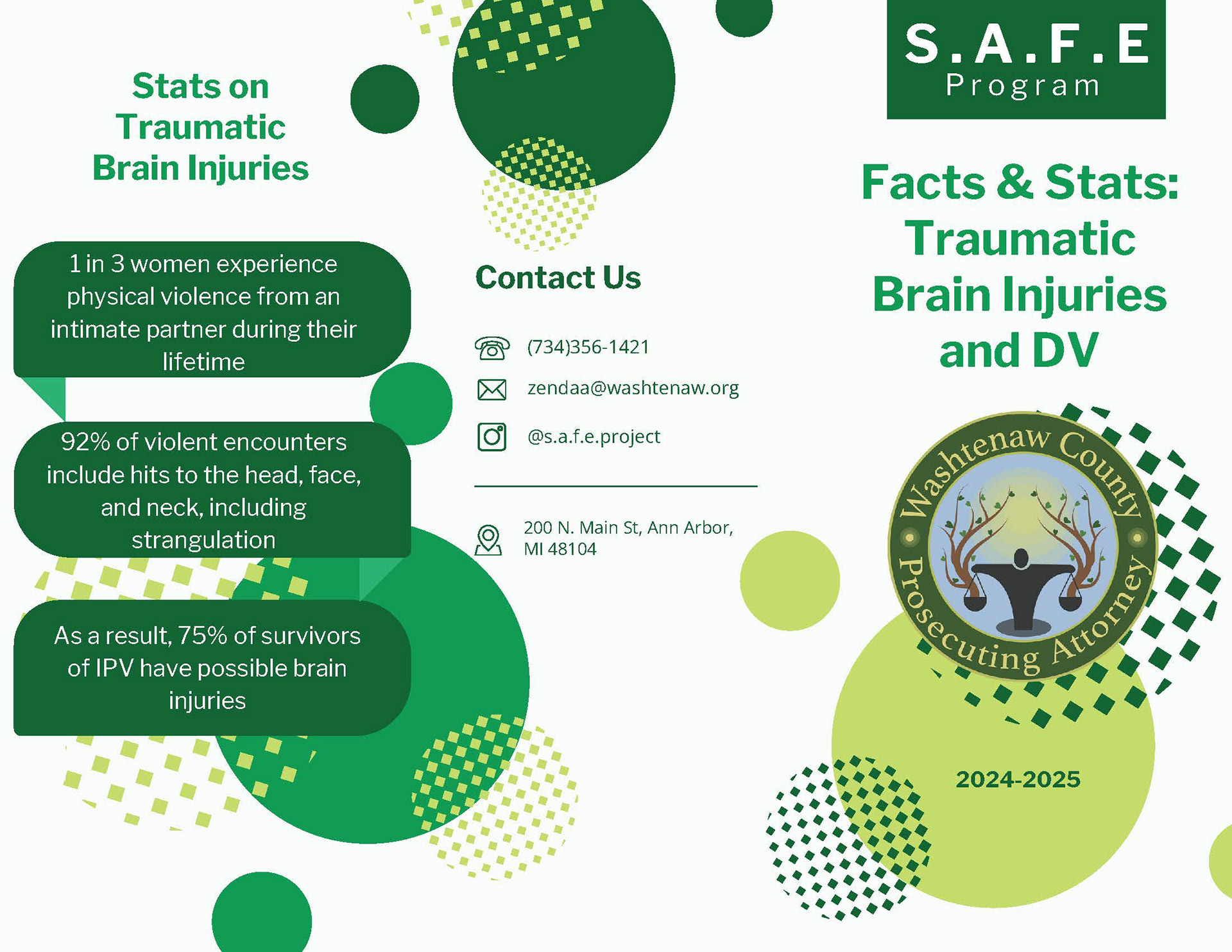
S.A.F.E. Program Brochures
Task: Redesign informational brochures originally drafted by policy experts to make them more visually engaging, accessible, and easier to navigate. The goal was to help viewers quickly understand how the Stand Against Firearms Endangerment (S.A.F.E.) Program serves as a resource when deciding whether to file for an Extreme Risk Protection Order (ERPO). I worked within the color palette provided by the team lead and prepared final layouts optimized for print production.
Design Analysis: To bring clarity to complex and sensitive content, I incorporated bold section headers, color-coded text areas, and boxed highlights to draw attention to key points. I also used subtle background patterns and soft color contrasts to make the material feel calm and approachable, recognizing that viewers may be experiencing emotional stress when reading this information. Above all, my goal was to create brochures that felt empowering and supportive, helping individuals feel informed and reassured during difficult situations.
Tools Used: Canva
Personal Designs
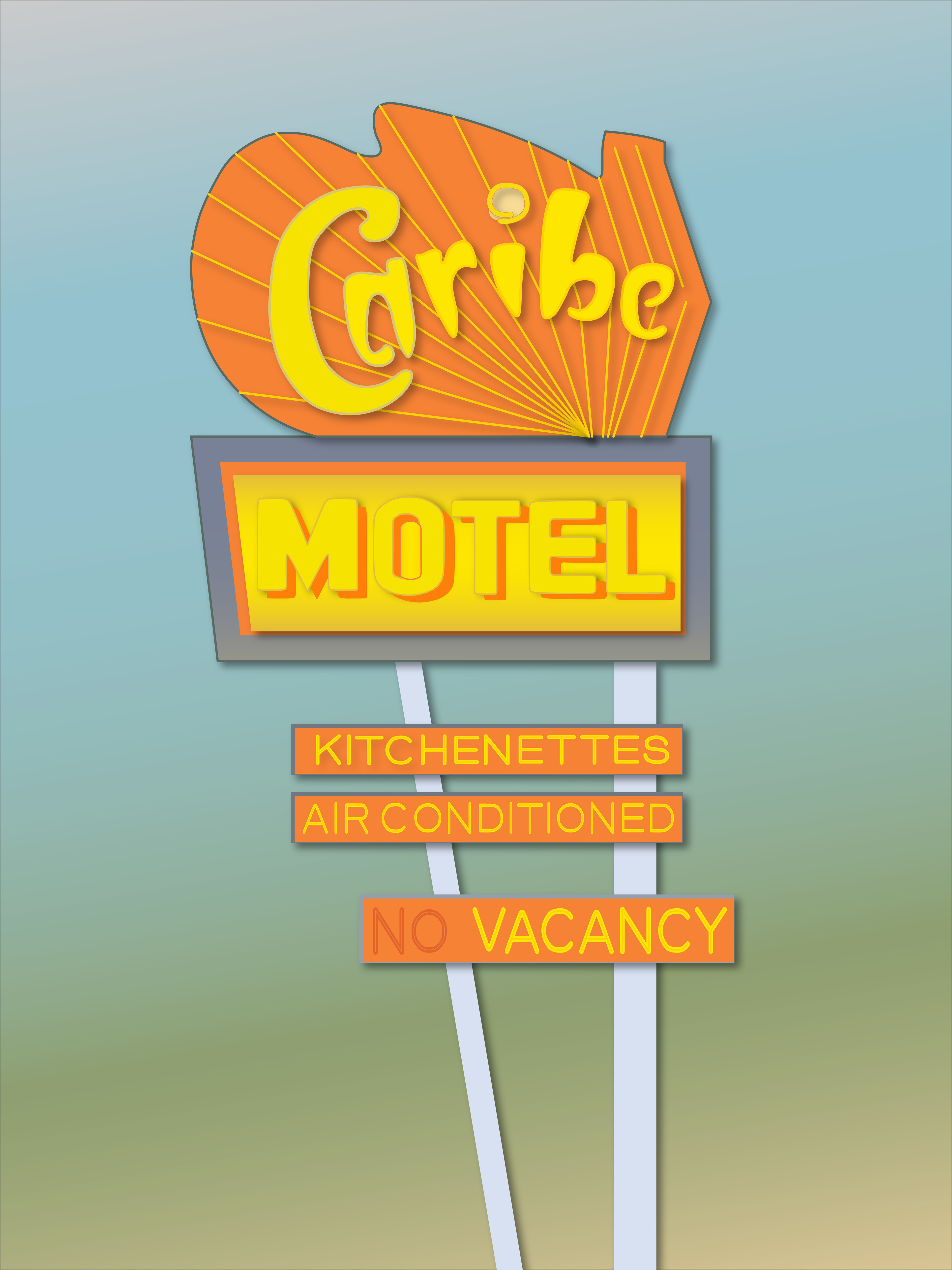
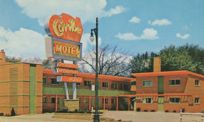
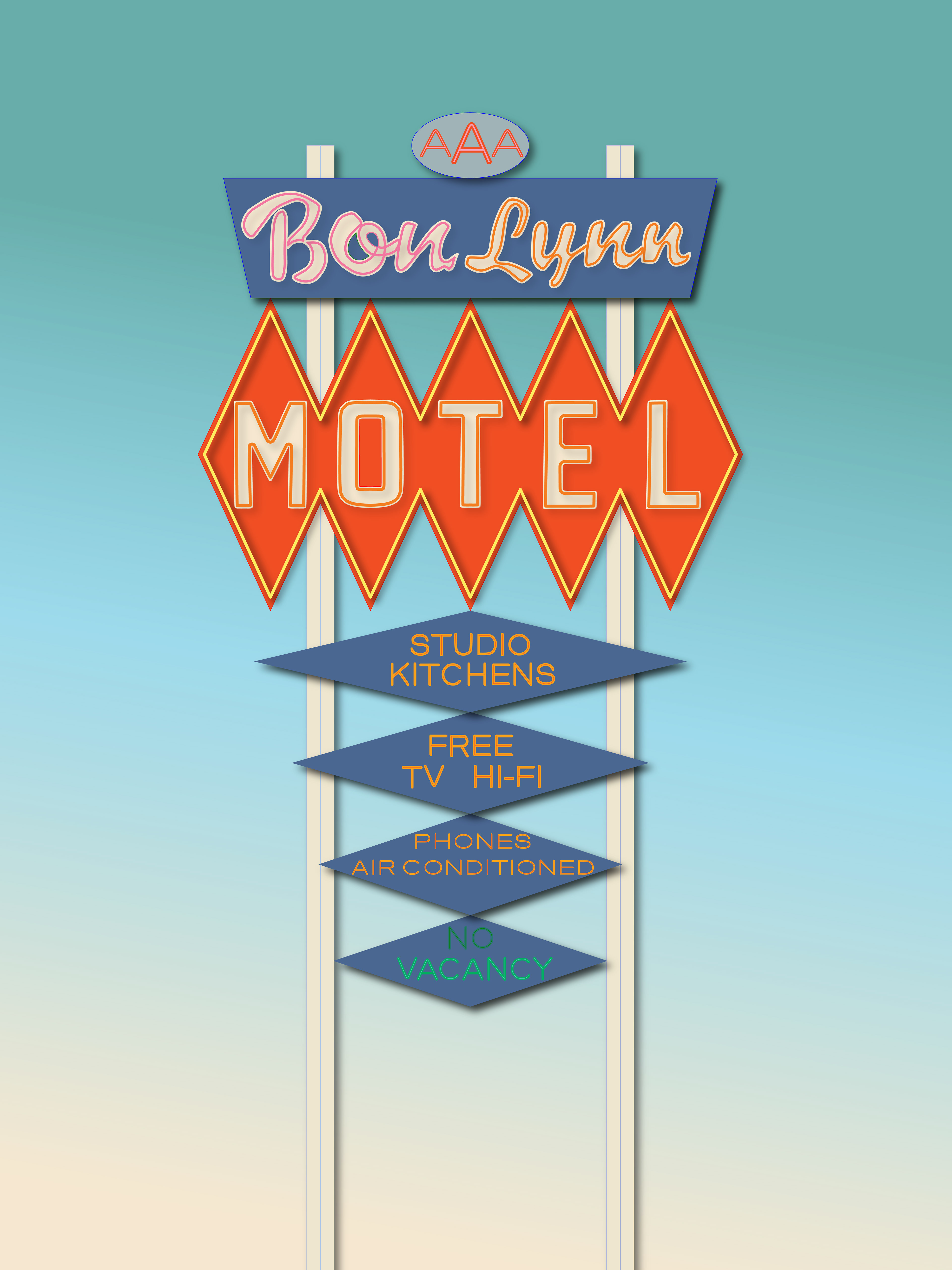
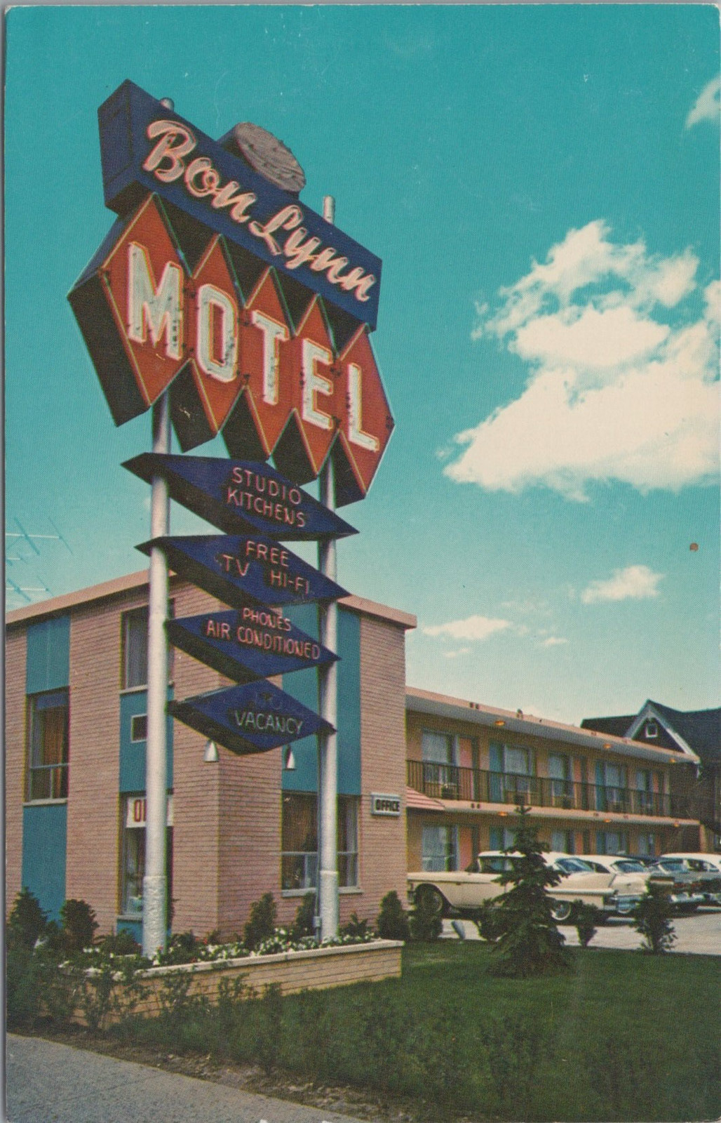
DETROIT MOTEL Series: In the 1960s, Detroit was home to over 100 motels—each with its own distinctive roadside sign designed to catch the attention of travelers long before the days of online reviews and booking apps. These signs weren’t just advertisements; they were colorful promises of comfort, affordability, and escape, each styled to highlight the amenities and character of the motel they represented.
Today, only a handful of these motels remain, and many of their once-iconic signs exist only in faded photographs and vintage postcards. Using digitized versions of these postcards and archival images, I digitally rebuilt several of these lost signs, carefully sampling original colors and recreating missing details through visual research.
The Caribe Motel and Bon Lynn Motel are two standout examples from this series, both representing the bold design choices and playful typography that defined mid-century roadside America. This project is both a tribute to Detroit’s visual history and a way to preserve the graphic language of a time when signage was storytelling.
Tools Used: Vintage Postcards, Rhino3D, Adobe Illustrator
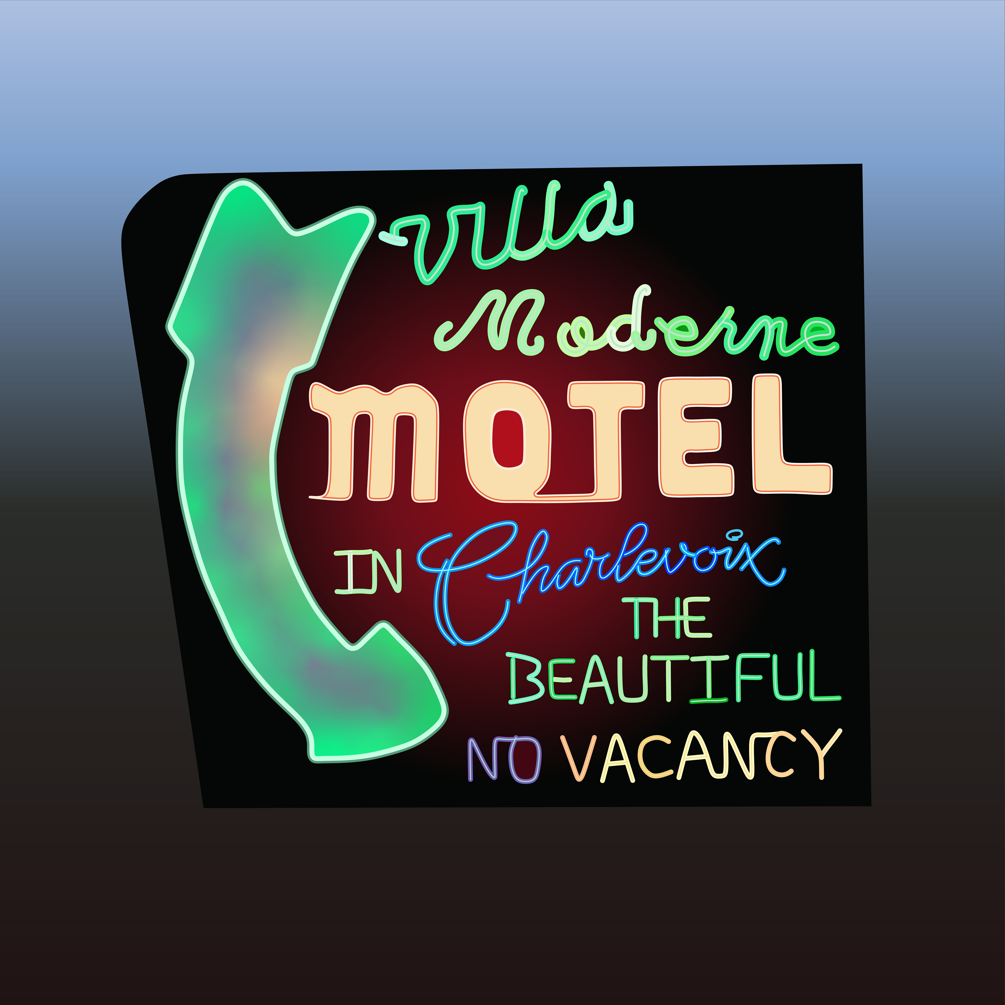
Villa Moderne Motel
Description: Some landmarks aren’t defined by their architecture, but by the emotional connection they build over time—and in Charlevoix, Michigan, the Villa Moderne Motel sign is exactly that. For over 70 years, this neon sign on Bridge Street has stood as a nostalgic beacon for visitors and locals alike. While the motel itself is modest, the sign’s bold mix of retro fonts, vibrant colors, and glowing arrow has become an unofficial icon of the city.
Having spent much of my childhood in Charlevoix, and now living out of state, I wanted to digitally recreate this piece of hometown history—a design that, until now, hadn’t existed in digital form. As a personal tribute and nod to the city’s motto, I incorporated the phrase “in Charlevoix the Beautiful” into the poster, giving both myself and others who love the town a visual reminder that there’s always a place to return to.
Tools Used: Rhino3D, Adobe Illisutrator
KLM Airline Poster
Description: Inspired by the vibrant tulip fields of the Netherlands, this poster captures the colorful first impression travelers often get when flying into Amsterdam on KLM. From above, the landscape comes alive with sweeping bands of orange, pink, red, yellow, and purple—rows of tulips stretching across the ground like a natural patchwork.
Channeling the bold, graphic style of 1960s airline posters, I incorporated angled blue lines drawn from the 1971 KLM logo color palette to create a sense of movement and direction, mimicking both the motion of flight and the rhythm of the fields below. The outline of a single tulip anchors the design, filled with layered stripes of color to represent the variety of blooms seen from the sky, while the green stem and leaves provide contrast and balance within the composition.
This piece is both a tribute to vintage travel design and a reflection of how color and perspective shape our earliest memories of a place.
Tools Used: Rhino3D, Adobe Illisutrator
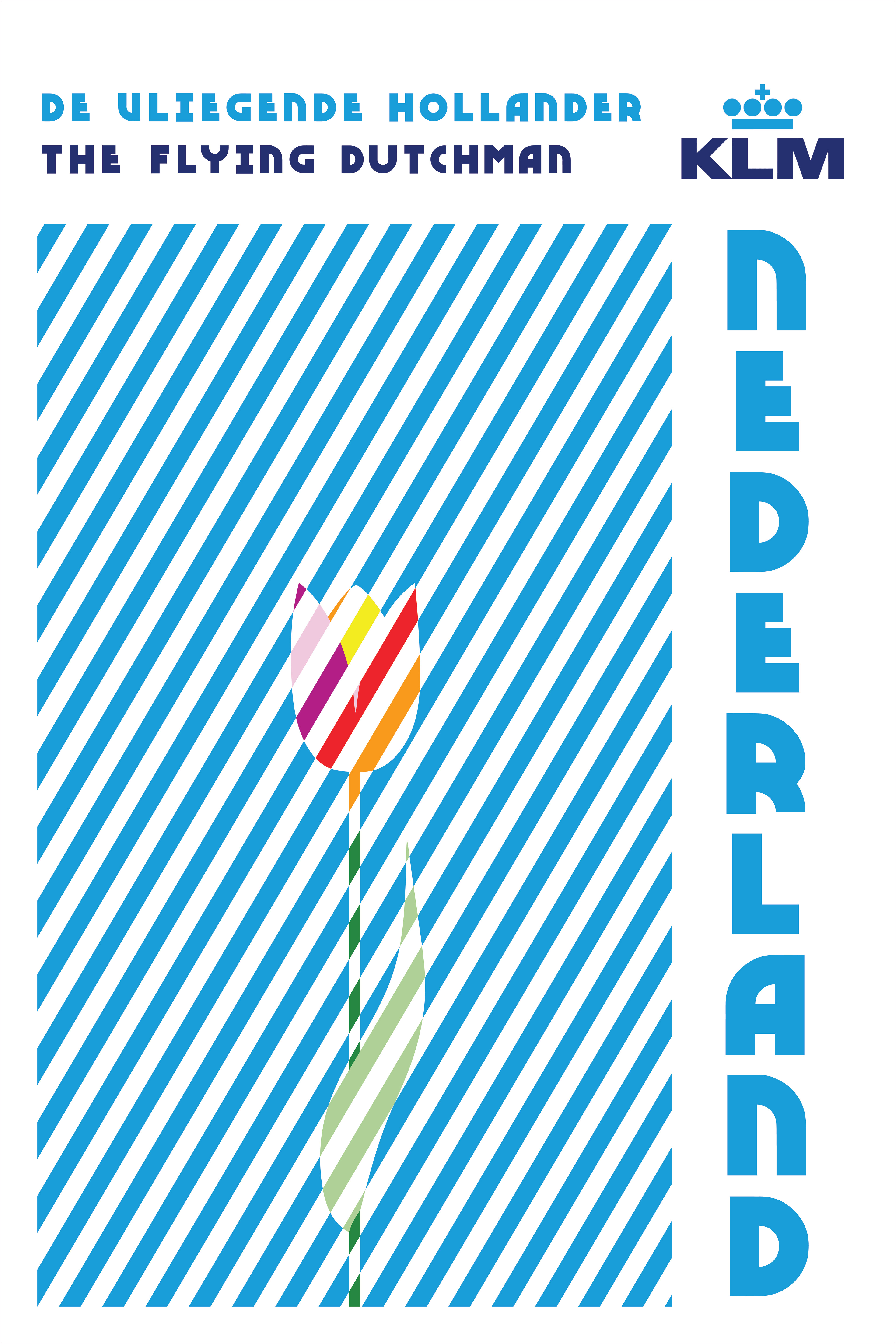
NOTE: This was a personal design and has not been sold. All Trademarks still belong to KLM Airlines